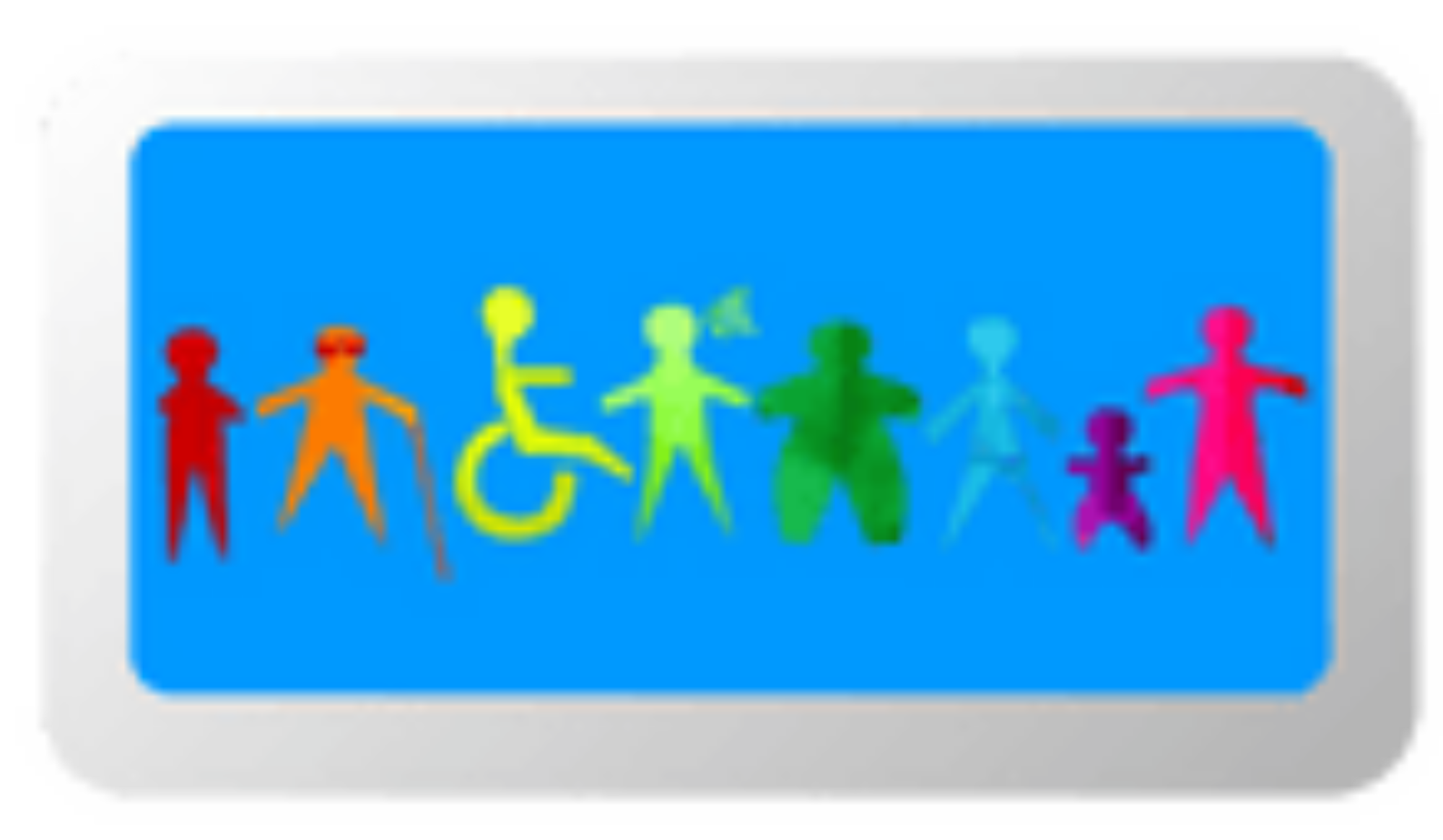
When I first started creating accessible print materials many years ago, it developed out of working directly with people with disabilities who needed information in different formats and my passion that everyone should have access to quality information so they could make informed choices. And amazing colleagues who would let me argue (sometimes for hours, sometimes longer) over wording and design.
One of my biggest takeaways from these experiences was – everyone is different and often when you create elements that are accessible for one person you can inadvertently create barriers for others. For me trying to create truly accessible information is a balancing act between communication needs, design, intent and people’s experiences and expectations. It is a process and the conversation is important.
This is the first in my series of blogs as I move more into the online accessibility space. Where I will be sharing what I learn as I go through the process to make my website more inclusive for more people. Starting with buttons…
Buttons should have one clear and defined purpose
Buttons need a clear, defined purpose that makes sense on your website. For example search, jump to main content, sign up here. If you are using only an icon or an image then make sure that it will make sense to your audience. The magnifying glass is widely used for a search icon but in some countries depending on the context there may be a more appropriate symbol.
Use semantic HTML and proper labels
To increase usability and accessibility HTML should be written using semantic tags of <button> or <input type = “button”> This lets screen readers, browsers and assistive technology know that there is a button. If your button only uses symbols instead of words you will need to use an aria-label so that people who use screen readers will know the button’s purpose.
Ensure keyboard and assistive device access
Make sure that your buttons can be accessed by people that navigate around webpages using their keyboard or assistive devices. This is especially important for people with motor impairments, arthritis and even gamers who prefer keyboard controls. Also, ensure buttons have a visible indicator to show which element is active.
Use sufficient colour contrast and multiple cues
In terms of colour, ensure that there is at least 4.5:1 contrast between the button, text (or icons) and their background. Colour can be used to indicate the different states (default, hover, focus, active (clicked), or disabled), but avoid relying solely on colour. Users many have varying levels of vision impairments of different types of colour blindness, so combine colour cues with other indicators like labels, shapes or outlines.
Size and spacing to prevent frustration
To reduce user frustration it is recommended to make the button at least 44 x 44 px and there is enough spacing between elements to prevent accidental clicks or taps.
Accessibility is an ongoing journey and learning process, which I look forward to sharing with you as I go.
What challenges have you faced using or designing accessible buttons? What have you found that helps?
References
W3C Web Accessibility Initiative. (2018). Web Content Accessibility Guidelines (WCAG) 2.1. https://www.w3.org/TR/WCAG21/
Mozilla Developer Network. (n.d.). Accessible buttons. MDN Web Docs. https://developer.mozilla.org/en-US/docs/Web/Accessibility/ARIA/Roles/button_role
World Wide Web Consortium (W3C). (2015). ARIA Authoring Practices 1.1. https://www.w3.org/TR/wai-aria-practices-1.1/